2026
Gapstars
Group
(Duration)
4 months
(Services)
Motion Identity
Motion System
UI / UX

(Overview)
Know More
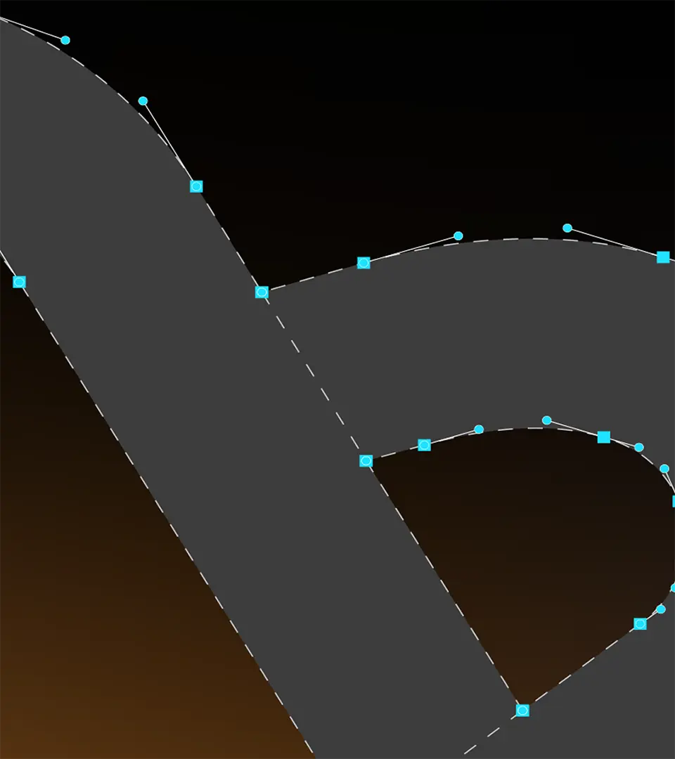
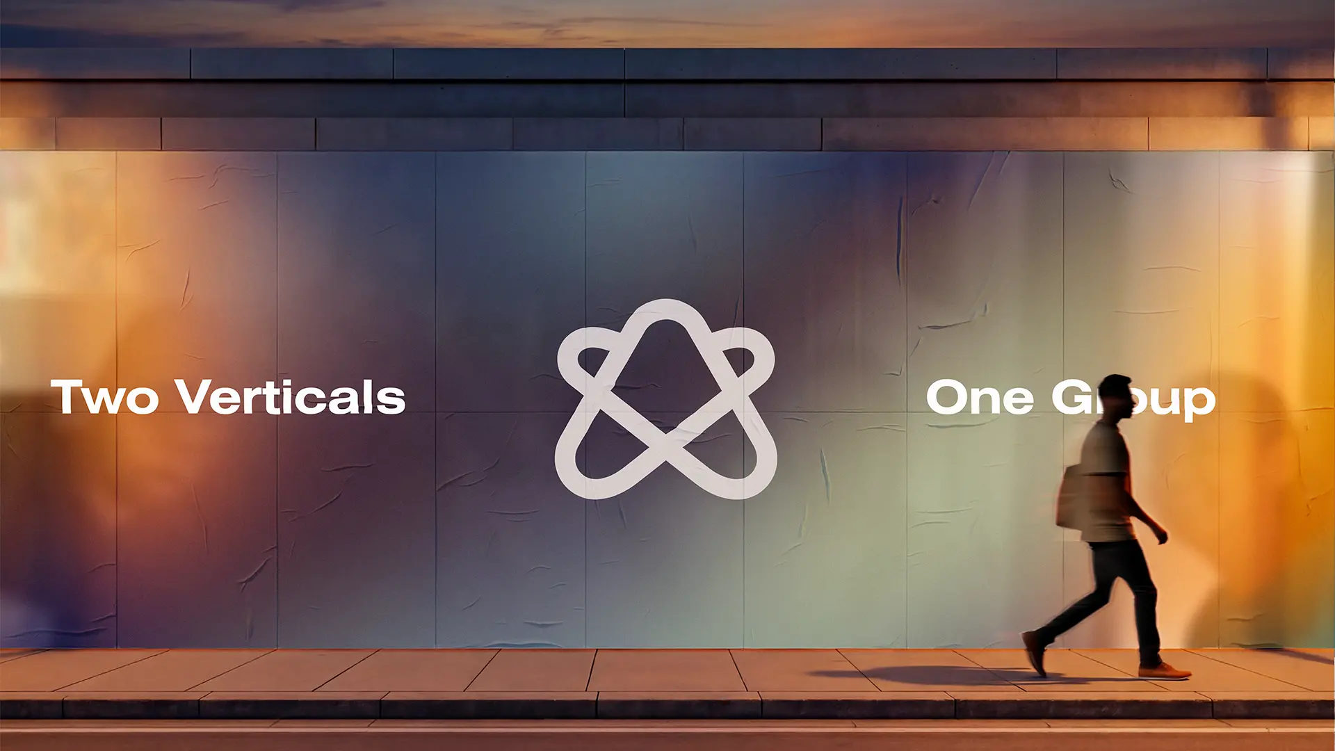
Arrows with a New Direction We started by breaking the Gapstars logo into two arrow forms: an upward orange mark for Gapstars Tech and a forward-leaning blue mark for Gapstars Finance. Each arrow became a standalone icon, finished with a soft 3D glassmorphism treatment that feels bright, tactile, and always in motion. Sequences that Tell the Story From there, we choreographed motion sequences that explain what each vertical does instead of just decorating the page. Gapstars Tech is shown through confident, fast transitions where the orange arrow guides viewers through engineering capabilities, hubs, and teams, while Gapstars Finance uses a steadier rhythm with the blue arrow framing icons and key messages about finance talent. A Unified Gradient for the Group To express Gapstars Group as one ecosystem, we merged the orange and blue worlds into a shared visual language. A deep fluid gradient that shifts from warm amber to electric blue sits behind the motion elements and highlights an organisation that is agile, connected, and focused on helping partners work more efficiently.
(Team)
Harsh Ahir
Shrey Gupta
(Collaborators)