2024
YatraDham

(Overview)
Yatradham's brand revamp strategy is rooted in understanding pilgrims’ needs—trust, simplicity, and reverence.
Using creative coding and AI micro tools, we built an elaborate visual system that balances devotion with modern ease. The result is a visual identity that feels both familiar and fresh.
Know More
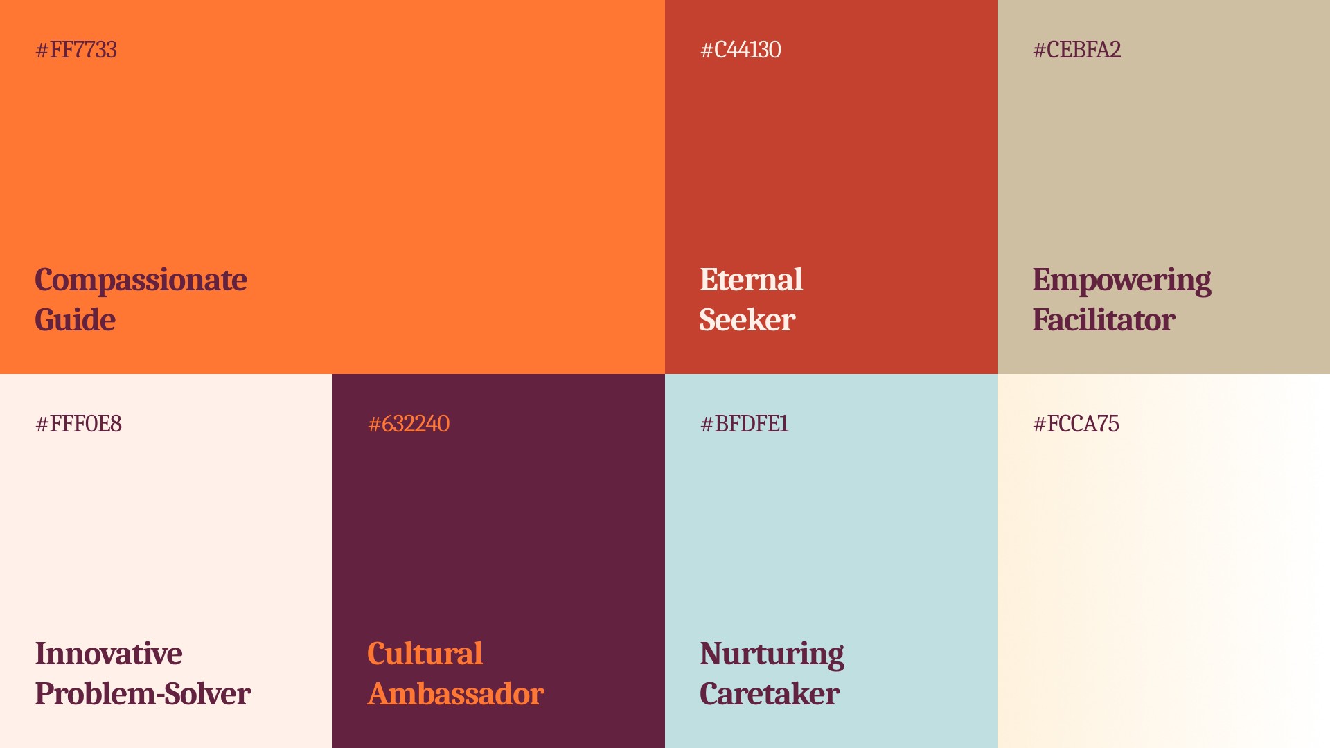
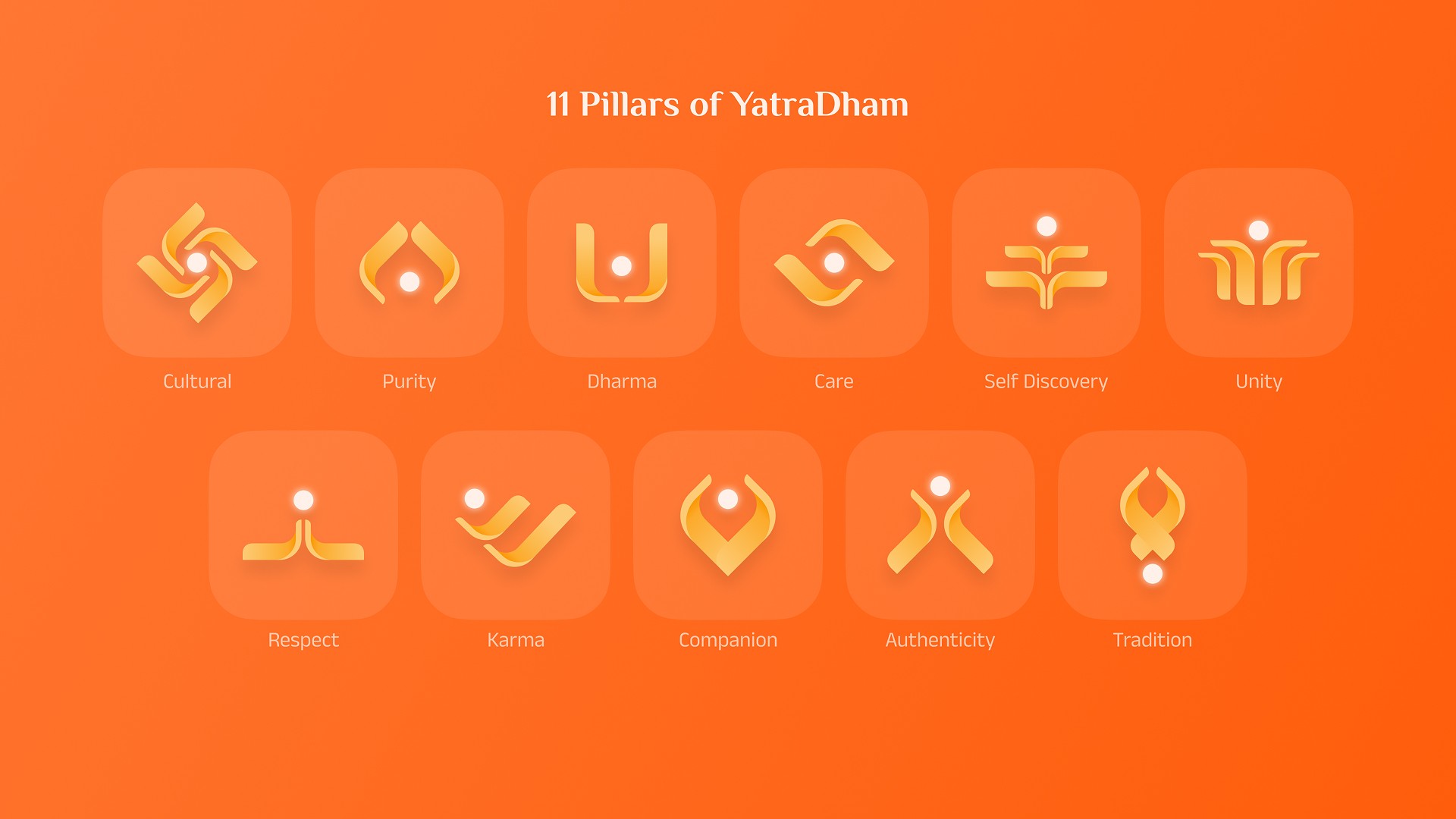
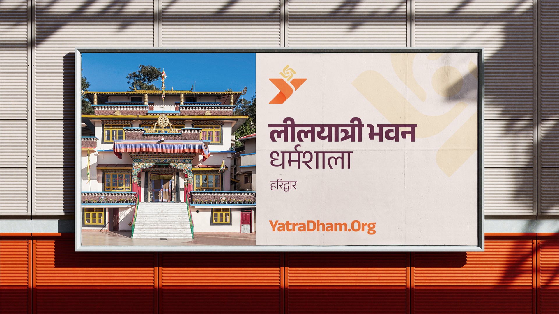
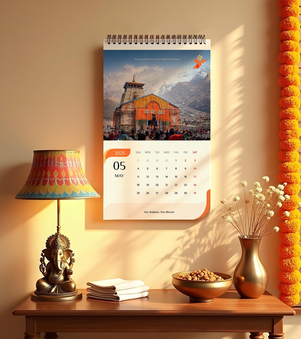
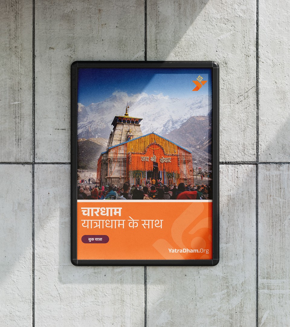
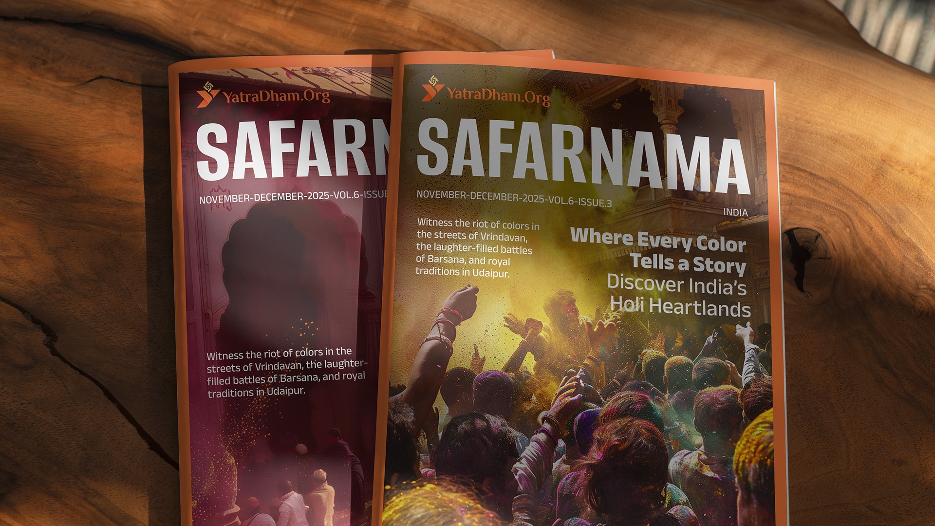
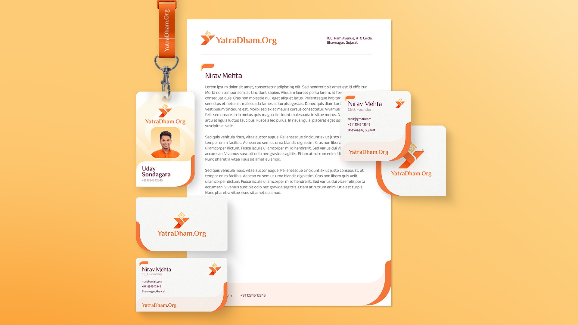
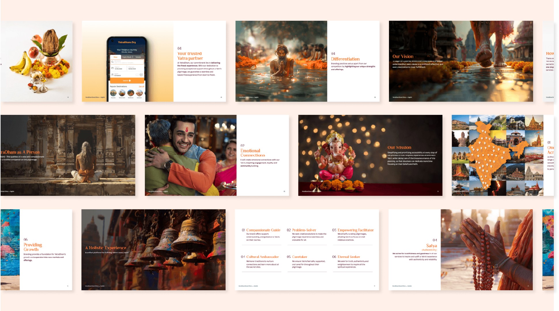
Born from Sacred Geometry At the heart of the brand lies the swastika—an ancient emblem of auspiciousness. We distilled its geometry into a cohesive design language using creative coding and AI micro-tools. From app icons to motion graphics, every element carries this sacred pattern uniting all the assets seamlessly. Crafting Consistency Across Scale With 400+ destinations and 3,100+ accommodations, YatraDham needed a system that could work everywhere while maintaining spiritual authenticity. We refined their color palette to reflect regional preferences and religious contexts, ensuring the brand feels familiar to the users. The Living Brand Ecosystem Every element from business cards to booking confirmations carries the same visual DNA. The communication strategy balances reverence with clarity, ensuring devotees feel guided rather than overwhelmed. Motion graphics breathe life into static elements, while the extended iconography speaks a universal language of spiritual service. Where Devotion Meets Convenience Booking a pilgrimage should feel like a blessing, not a chore. We redesigned the website with intuitive flows, clear calls to action, and quiet touches of sacred geometry guiding every step. Color-coded waypoints and gentle micro-interactions help users select destinations, view accommodations, and complete bookings with confidence.

